
New Growth Stocks Are the Real Value Premium
Hey, I’m KP and thank you for joining 45,000+ professional investors reading my weekly newsletter. Each week, I work with PhDs to translate top-tier finance research into plain English — revealing evidence-based ideas that matter to professional investors, analysts, and CIOs.
In this week’s report:
Newly classified ‘growth stocks’ underperform so badly that they double the value premium
A PE fund's 20% IRR may only be worth 12% after accounting for hidden credit risk
Research-grounded Investor Q&A: “Does management tone during earnings calls say anything about future returns?”
1. Newly classified ‘growth stocks’ underperform so badly that they double the value premium
Value vs. Growth: What Drives the Value Premium? (February 13, 2026) - Link to paper
TLDR
Half of all value and growth stocks are "new" each year, i.e. stocks that migrated from other categories.
The value premium from these new stocks (return of new value stocks less return of new growth stocks) is 0.33% monthly vs. 0.15% for incumbents (stocks that were categorized as value or growth at least the prior 2 years too).
It’s not because new value stocks outperform ‘old’ value stocks but rather that new growth stocks dramatically underperform because they have weak fundamentals despite high valuations. They're last year's winners that ran too far.
The effect intensifies during economic stress: the "new" value premium outperforms the "old" by 0.71% monthly in contractions and 0.79% during Fed tightening cycles. Perhaps an interesting ‘hedge’ strategy during downturns?
The big picture
The value premium – the tendency for cheap (value) stocks to outperform expensive (growth) ones – is one of the most studied phenomena in finance. But where does it actually come from?
Do all value and growth stocks contribute equally to the premium, or do some matter more than others?
What the authors did
They studied U.S. stocks from 1970 to 2024 using the standard Fama-French methodology. Each June, they sorted stocks into three groups based on book-to-market ratios:
Value stocks: Top 30% (high book-to-market, meaning cheap relative to book value)
Growth stocks: Bottom 30% (low book-to-market, meaning expensive relative to book value)
Middle stocks: The remaining 40%
Then they asked: how many of these value and growth stocks are actually new to their category?
The surprising finding: half the deck reshuffles every year
Here's what many investors don't realize: value and growth aren't stable categories.
The authors defined "old" value stocks as those classified as value for three consecutive years (year t, t-1, and t-2). Everything else is "new."
That's a high bar. Each year, about 74% of value stocks remain value the following year. But to stay value for three straight years, a stock must survive two transitions: 74% × 74% ≈ 55%.
That leaves roughly half of all value stocks as newcomers – they either just migrated in or bounced in and out over the prior two years. Growth stocks show the same pattern: about 52% are new in any given year.
The core result: new stocks drive the value premium
The value premium from new value and growth stocks is 0.326% per month.
The value premium from old value and growth stocks is 0.147% per month.
That's more than double. The difference of 0.179% monthly is statistically significant and economically meaningful – it compounds to roughly 2.1% per year.
But here's the key insight: the difference comes almost entirely from new growth stocks underperforming, not from new value stocks outperforming.
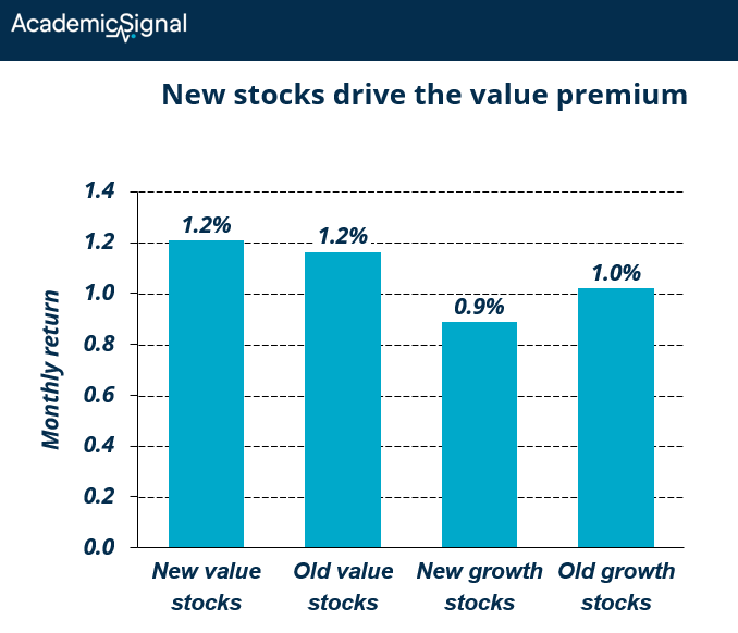
New value stocks perform about the same as old value stocks. But new growth stocks lag old growth stocks by 0.13% per month – a gap of 1.6% annually.
Why new growth stocks underperform: the profile of a loser
The authors dug into the characteristics of these stocks. New growth stocks are:
Smaller and younger: They're less established companies, often still proving their business models.
Weaker on fundamentals:
Lower operating profitability (35.5% vs. 44.7% for old growth)
Lower ROE (9.7% vs. 22.4%)
Lower ROA (5.2% vs. 10.8%)
Negative earnings growth vs. positive for incumbents
More leveraged: Higher debt ratios despite weaker cash flows.
More expensive: Despite all these weaknesses, they trade at higher earnings multiples than incumbent growth stocks.
Past winners: New growth stocks averaged 94% returns over the prior two years versus 54% for old growth stocks.
This is the recipe for disappointment. These stocks rode momentum into the growth category. Their prices ran up faster than their fundamentals. Now they sit in portfolios with high expectations baked in and weak underlying businesses. When reality catches up, they underperform.
New value stocks: a different story
New value stocks tell the opposite tale. They became cheap because their stock prices fell – they averaged just 4% returns over the prior two years versus 29% for incumbent value stocks.
But their fundamentals are actually better than old value stocks:
Higher operating profitability (20.5% vs. 18.5%)
Higher ROE (6.2% vs. 4.8%)
Higher ROA (3.3% vs. 2.6%)
Higher sales growth (15.1% vs. 7.1%)
These are companies that got marked down by the market but still have solid businesses. Classic value investing territory.
The risk-adjusted picture
Raw returns only tell part of the story. The authors also looked at alphas (returns adjusted for exposure to known factors like market, size, profitability, and momentum).
The monthly alpha spread between new value and new growth stocks is 0.133%.
The monthly alpha spread between old value and old growth stocks is -0.272%.
That's a difference of 0.405% per month in risk-adjusted terms – nearly 5% annually. The "new" value premium generates real alpha; the "old" value premium actually destroys it after controlling for other factors.
The Sharpe ratio tells a similar story:
New value premium: 0.076
Old value premium: 0.038
And the return distribution is more favorable for the new value premium: positive skewness (0.34 vs. 0.05) and higher kurtosis, meaning a fatter right tail with more upside surprises.
When this effect matters most
The spread between new and old value premium isn't constant. It surges during specific market conditions:
Economic contractions
During NBER-defined recessions, the monthly alpha difference between new and old value premium hits 0.707% – that's 8.5% annualized.
Why? New growth stocks crater when their optimistic expectations collide with deteriorating economic conditions. Their weak fundamentals get exposed. Meanwhile, new value stocks – already priced for distress – have less room to fall.
Fed tightening cycles
When the Fed is raising rates, the monthly alpha difference reaches 0.794% – 9.5% annualized.
Growth stocks are long-duration assets. Their value depends heavily on distant future cash flows, which get discounted more aggressively when rates rise. New growth stocks, with their weaker current cash flows and higher leverage, suffer most.
High interest rate environments
When the 10-year Treasury yield is above its historical median, the alpha spread is 0.586% monthly.
Higher discount rates punish speculative names. New growth stocks, often priced on hope rather than current profitability, see the steepest markdowns.
High uncertainty periods
Using the Jurado-Ludvigson-Ng macroeconomic uncertainty index, the alpha spread during uncertain times is 0.612% monthly.
When uncertainty rises, investors flee from stocks with weak fundamentals and unclear paths to profitability; exactly the profile of new growth stocks.
The flip side: when it doesn't matter
During expansions, monetary easing, low rates, and low uncertainty, the difference between new and old value premium essentially disappears. Rising tides lift all boats, including the shakiest ones.
Within-industry vs. across-industry: where the returns come from
The authors separated two effects:
Within-industry: Comparing cheap and expensive stocks in the same sector
Across-industry: Comparing cheap sectors to expensive sectors
Most prior research suggests the value premium comes mainly from within-industry differences. But for the new value premium, the pattern reverses.
Using industry-adjusted book-to-market ratios (removing industry effects), the new value premium drops to just 0.067% monthly, statistically indistinguishable from the old value premium.
But using industry-median book-to-market ratios (capturing only industry effects), the new value premium is 0.149% versus -0.109% for the old. The difference is highly significant.
Translation: The elevated returns from new value and growth stocks come from industry rotation, not from stock selection within industries.
When tech becomes overvalued and energy becomes cheap, the stocks migrating into growth (tech) and value (energy) drive the returns. Quant managers focused only on intra-industry value signals may be missing the bigger opportunity.
Building the optimal portfolio
A "value factor" portfolio goes long value stocks and short growth stocks. The authors built two versions: one using only new stocks, one using only old stocks. Then they asked: what's the best combination?
The result: 91.68% weight on the new value factor, 8.32% on the old.
The optimal portfolio's Sharpe ratio (0.0763) slightly exceeds the new value factor alone (0.0761) and far exceeds the old value factor (0.0382).
For practical purposes, you can think of the old value factor as nearly redundant once you have the new value factor.
The bottom line
When evaluating growth stocks, check how long they've been in the category. Recent entrants with weak fundamentals and strong past returns are the most dangerous. They've already had their run.
For value stocks, recent migrants with solid fundamentals are the sweet spot. The market marked them down, but the business is fine.
2. A PE fund's 20% IRR may only be worth 12% after accounting for hidden credit risk
Credit Risk and the Private Equity J-Curve: A Framework for Risk-Adjusted Performance Measurement (February 3, 2026) - Link to paper
TLDR
Traditional PE metrics ignore 500-800 basis points of embedded credit risk from portfolio company leverage.
A 30% IRR tech fund can rank below an 18% diversified fund once you adjust for default probability, loss severity, and correlation effects.
Practical guardrails: cap single-vintage exposure at 30%, limit asset-light sectors to 40% of portfolio, and maintain liquidity reserves of 35-50% of PE NAV.
The blind spot in PE performance measurement
When LPs evaluate fund re-commitments in years 3-5, they face a structural problem. At this stage, capital is deployed, leverage is in place, but exits remain limited. The standard performance metrics (IRR and TVPI) reflect unrealized gains on surviving investments while ignoring probability-weighted losses from defaults that haven't occurred yet.
The authors tackle this gap by adapting Expected Credit Loss (ECL) methodology – standard in banking under IFRS 9 and CECL accounting rules – to private equity. Their framework quantifies forward-looking credit risk the same way CDS (credit default swap) spreads price default risk in credit markets.
How the framework works
The core equation is straightforward. For each portfolio company, Expected Credit Loss equals:
ECL = Exposure at Default × Probability of Default × Loss Given Default
Let's break down each component:
Exposure at Default (EAD)
EAD is the amount of money at risk if a company defaults. In private equity, this is typically your invested capital plus any committed but uncalled follow-on capital. If you've invested $10 million in a company and committed another $2 million for future needs, your EAD is $12 million.
Probability of Default (PD)
PD is the likelihood that a company will fail to meet its debt obligations over a specific time horizon – typically five years for PE holding periods. This depends on several factors:
Leverage: A company with 6x debt-to-EBITDA is far more likely to default than one with 3x leverage
Sector: Technology companies fail more often than industrial companies
Economic conditions: Default rates spike during recessions
GP quality: Better managers select stronger companies and intervene earlier when trouble emerges
The authors calibrate PD using corporate credit data. Typical five-year cumulative default probabilities range from 8-12% for conservative industrial deals to 15-25% for highly leveraged technology investments.
Loss Given Default (LGD)
LGD measures what percentage of your investment you lose when a default occurs. This is where private equity differs dramatically from corporate bonds.
What does bond LGD mean? In corporate credit markets, LGD refers to the loss a bondholder suffers after recoveries. If a company defaults and bondholders recover 60 cents on the dollar, their LGD is 40%. Historical corporate bond LGD averages 40-60%.
Why PE equity LGD is much higher: PE investors hold equity, which sits behind all debt claims in the capital structure. When a portfolio company defaults, debt holders get paid first from whatever enterprise value remains.
Example: A company was acquired for $100 million enterprise value with 60% debt ($60 million) and 40% equity ($40 million from the PE fund). The company defaults, and in bankruptcy, the enterprise is sold for $50 million (50% recovery on enterprise value, which actually quite good for a distressed sale).
Debt holders receive: $50 million (their full recovery)
Equity holders receive: $0 (nothing left after debt is paid)
PE fund's LGD: 100%
Even with "decent" enterprise value recovery, equity gets wiped out because debt has priority. This is why the authors estimate PE equity LGD of 75-90% for asset-light sectors (software, services) where there's little tangible collateral, and 30-50% for asset-heavy sectors (manufacturing, real estate) where equipment and property retain value.
Adjusting traditional metrics for credit risk
Once you calculate ECL for each portfolio company, you can adjust the standard metrics.
Credit-Adjusted TVPI
The formula modifies the numerator by subtracting expected credit losses:
Credit-Adjusted TVPI = (Distributions + NAV − Total ECL) / Capital Called
NAV (Net Asset Value) is the current marked value of unrealized investments. If a fund has distributed $30 million, holds $80 million NAV, has $15 million in expected credit losses, and called $100 million in capital:
Traditional TVPI: ($30M + $80M) / $100M = 1.10x
Credit-Adjusted TVPI: ($30M + $80M − $15M) / $100M = 0.95x
The 0.15x difference (15% of capital) represents the embedded credit risk traditional metrics ignore.
Credit-Adjusted IRR
IRR adjustment is more complex because timing matters. The framework incorporates period-by-period changes in ECL into the cash flow calculation. Early losses hit IRR harder than late losses because:
They reduce the capital base that compounds over time
They occur before exits generate offsetting distributions
IRR math heavily penalizes early negative cash flows
A practical rule: a 10% ECL can reduce IRR by 300+ basis points when defaults concentrate in years 2-4 of the fund's life. The authors derive a "J-Curve Factor" of approximately 1.3x to convert ECL percentage into IRR impact, meaning 10% ECL translates to roughly 13% IRR drag.
What the numbers show: vintage year analysis
The authors apply their framework to 38 years of Cambridge Associates benchmark data combined with S&P LCD leverage statistics and Moody's default rates.
Peak vs. trough vintages: Peak vintages (2006-07, 2021-22) deployed capital when valuations were high and leverage was aggressive. Trough vintages (2009-10, 2019-20) invested after market corrections when prices were lower and lending was conservative.
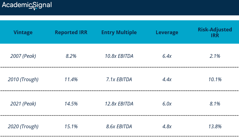
Peak vintages exhibit 490 basis points higher IRR bias on average than trough vintages. The 2007 vintage shows the largest gap: 8.2% reported versus 2.1% risk-adjusted, a 610 basis point difference driven by elevated entry multiples and leverage.
Why does this happen? Peak-vintage deals at 12x entry with 70% debt retain only 3.6x EBITDA as equity buffer. Trough-vintage deals at 8x entry with 30% debt retain 5.6x EBITDA equity cushion. The thinner buffer means any EBITDA decline quickly triggers distress.
The correlation amplification effect
Here's where portfolio construction gets dangerous. The authors show that portfolio-level credit risk isn't simply the sum of individual company risks – correlation between defaults amplifies total exposure.
What is default correlation? It measures how likely companies are to default together. If two companies have 0.5 correlation, when one defaults, there's a significantly elevated probability the other will too. Companies in the same sector facing the same industry headwinds (retail during e-commerce disruption, energy during oil price collapse) have high correlation. Companies across different sectors have low correlation.
Typical correlations:
Within same sector: 0.4-0.7
Across different sectors: 0.1-0.3
During market stress: correlations spike to 0.6+ across the board
The math in action: Consider a 10-company portfolio with $2 million ECL per company.
Assuming independence (correlation = 0): Total Expected Loss = 10 × $2M = $20 million
Assuming 0.5 correlation: Total Expected Loss = $20M + correlation amplification = $65 million
The correlation effect more than triples expected losses. This explains why concentrated, same-vintage, same-sector portfolios face catastrophic losses during market stress that traditional metrics completely miss.
Case study: when the "worse" fund is actually better
The framework's power shows in a head-to-head comparison. A pension fund evaluates two $100 million commitments:
Fund A: TechVentures Growth Fund IV
Historical track record: 30% net IRR across three prior funds
Strategy: concentrated technology/software focus
Entry multiples: 14x EBITDA (peak levels)
Sector HHI: 0.68 (highly concentrated)
Expected LGD: 85% (minimal tangible assets)
Default correlation: 0.50 (same-sector exposure)
Fund B: Diversified Partners Fund VII
Historical track record: 18% net IRR
Strategy: multi-sector (industrial, healthcare, consumer, tech)
Entry multiples: 11x EBITDA
Sector HHI: 0.25 (well diversified)
Expected LGD: 60% (mixed asset base)
Default correlation: 0.25 (cross-sector diversification)
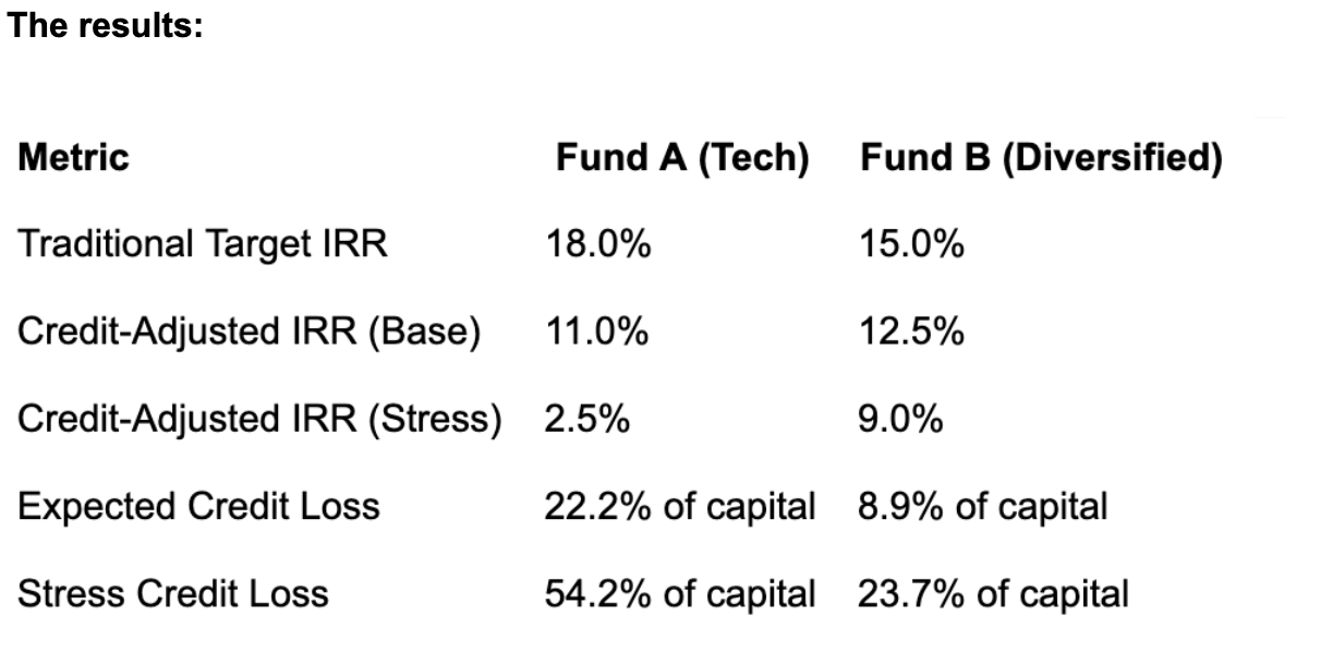
Despite Fund A's superior historical performance (30% vs. 18%), credit risk analysis reverses the ranking. Fund B offers higher risk-adjusted returns, superior downside protection, and dramatically lower tail risk. Fund A's historical outperformance reflected favorable vintage timing and tech sector tailwinds – not superior risk-adjusted skill.
The bottom line
A fund reporting 20% IRR with 500 basis points of ECL-implied risk embeds approximately 15% credit-risk-adjusted expected return. That 15% – not the 20% – is the number that should drive your allocation decision.
The framework doesn't replace traditional metrics; it complements them. IRR and TVPI accurately measure realized cash flows. ECL adds the forward-looking risk dimension these metrics structurally cannot capture. For institutional investors making multi-year, multi-billion dollar allocation decisions, that missing dimension can mean the difference between a portfolio that compounds wealth and one that suffers permanent capital impairment during the next credit cycle.
3. Research-grounded Investor Q&A: “Does management tone during earnings calls say anything about future returns?”
Yes – management tone predicts returns. However, traditional dictionary-based approaches have largely stopped working, while machine learning and large language models now capture incremental predictive information that dictionary methods miss entirely.
The Dictionary Death: Frankel, Jennings & Lee (2022)
The Frankel, Jennings & Lee (2022) study compared machine learning methods against the standard Loughran-McDonald dictionary for extracting sentiment from 10-K filings and conference calls. They found that ML does explain returns at conference call dates, whereas dictionary-based approaches don’t work anymore.
A plausible explanation: managers adapted. Once investors and analysts began using dictionary-based sentiment analysis, executives learned to filter out negative keywords during conference calls. The predictive power degraded precisely because the methodology became public knowledge. Machine learning models, with their ability to detect subtler patterns and context, are harder to game.
FinBERT Outperforms Everything Before It
Huang, Wang & Yang (2023) introduced FinBERT: a BERT model pre-trained on 2.5 billion tokens from annual/quarterly reports, 1.3 billion from earnings call transcripts, and 1.1 billion from analyst reports. FinBERT achieved state-of-the-art performance on financial sentiment classification.
A hybrid FinBERT-LSTM model combining sentiment analysis of quarterly earnings calls with price prediction methods achieves superior predictive accuracy for stock price movements, as demonstrated in Sarkar & Shahid (2025).
LLM-Based Sentiment: The New Frontier
Kirtac & Germano (2024) found that GPT-3-based models (OPT) achieve 74.4% accuracy in sentiment prediction from financial news, compared to 72.2% for FinBERT and just 50.1% for the Loughran-McDonald dictionary. A self-financing strategy based on OPT sentiment scores achieved a Sharpe ratio of 3.05 over the sample period versus 1.23 for dictionary-based strategies.
Chen et al. (2024) extended this work by developing a finance-specific LLaMA-2 model for analyzing 10-K MD&A sections. Trading strategies based on LLaMA-2 sentiment produced significantly higher buy-and-hold returns compared to FinBERT and traditional models.
Tone Distance: Within-Call Manager Disagreement
Angelo et al. (2025) introduced "Tone Distance" – the variance in tone between different managers speaking on the same earnings call. When the CEO sounds optimistic but the CFO sounds cautious, that divergence predicts:
Negative event-period returns around the announcement
Higher subsequent stock volatility and information uncertainty
Lower future growth prospects (measured by Tobin's Q)
Positive predictability of monthly returns post-announcement
The interpretation: tone divergence represents information leakage. Firms carefully script presentations, but during Q&A, different executives reveal different perspectives. Investors treat manager disagreement as a signal of fundamental uncertainty and demand a risk premium.
Audio Signals Beyond Text
Gong et al. (2023) used deep learning to extract emotional information from the audio of earnings conference calls. They found that audio-derived sentiment predicts securities analyst behavior – incremental to the textual transcript. The mechanism: managers can carefully choose words, but vocal cues (pitch variation, stress patterns, pacing) are harder to consciously control and leak private information.
This builds on earlier work showing vocal tone during Q&A, where managers face unpredictable questions, is particularly informative, since scripted answers to anticipated questions carry less signal.
Practical Implementation Considerations
Signal construction: Use FinBERT or GPT-based models rather than dictionary methods. Focus on the Q&A section, not prepared remarks. Consider audio features if infrastructure permits.
Timing: Stock prices now incorporate tone information rapidly – often by market open. The predictable drift occurs in the subsequent 60 trading days, concentrated in high-uncertainty firms.
Decay risk: As machine learning methods become standard, expect alpha to compress. The original dictionary-based signals decayed once methodology became common knowledge; the same will likely happen to FinBERT/LLM approaches.
Disclaimer
This publication is for informational and educational purposes only. It is not investment, legal, tax, or accounting advice, and it is not an offer to buy or sell any security. Investing involves risk, including loss of principal. Past performance does not guarantee future results. Data and opinions are based on sources believed to be reliable, but accuracy and completeness are not guaranteed. You are responsible for your own investment decisions. If you need advice for your situation, consult a qualified professional.