
Forced Sellers, Mispriced Mega-Caps, and the Yield Curve Debate
Research-grounded Investor Q&A. Have an interesting idea and would like a thesis check grounded on academic research? Email your query to kp@academicsignal.com and our Research Fellows will tackle the most interesting questions.
In this week’s report:
When mutual funds must sell: an exploitable pattern from regulatory forced selling in mega-cap stocks
When pension plans must sell: an exploitable pattern in PE secondary markets
Research-grounded Investor Q&A: “Does the yield curve actually predict recessions, or do we just remember the times it worked?” [Premium Content]
1. When mutual funds must sell: an exploitable pattern from regulatory forced selling in mega-cap stocks
The Hidden Cost of Stock Market Concentration: When Funds Hit Regulatory Limits (December 17, 2025) - Link to paper
TLDR
Rising market concentration is forcing funds to dump their largest holdings to comply with tax rules, creating temporary mispricings in mega-cap stocks
A "constrained ownership" (C) metric predicts which stocks will outperform: high-C stocks earned 7.9% annual alpha in 2019-2024
The effect is strongest in volatile stocks held by active funds, with the high-volatility strategy delivering nearly 12% annual alpha in 2023-2024
What the authors discovered
As the "Magnificent 7" and other mega-caps have come to dominate indexes, funds are being forced to sell these stocks to comply with the 50/5/10 diversification rule, regardless of their investment views.
The 50/5/10 diversification rule is a requirement under the Investment Company Act of 1940 that defines what qualifies as a "diversified" management investment company (primarily mutual funds and ETFs).
Here's how it works:
At least 50% of the fund's total assets must be held in a diversified manner
Within that diversified portion, no more than 5% of the fund's total assets can be invested in securities of any single issuer
The fund cannot hold more than 10% of the outstanding voting securities of any single issuer
The remaining 50% of assets can be invested more freely, including concentrated positions, though other prudent investment limitations still apply.
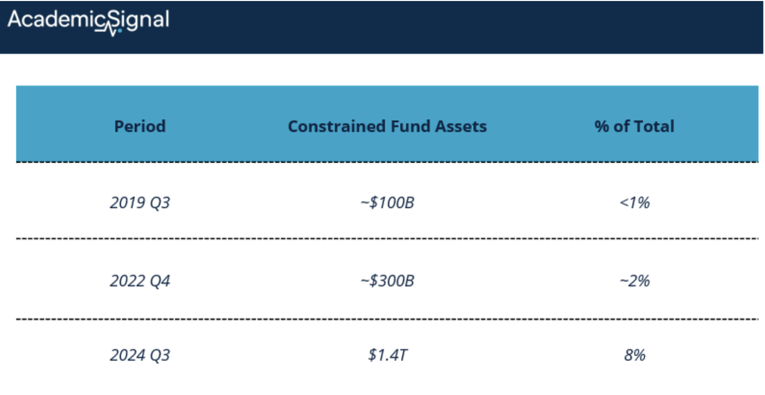
Historically a formality, this constraint has become binding: by Q3 2024, 171 funds managing $1.4 trillion (8% of total fund assets) were constrained. Among large-cap growth funds specifically, one-third of funds holding half the category's assets hit this wall.
The mechanism: current mispricing, not future downside
A “high-C” stock is one that's currently being underweighted by constrained funds relative to what they'd otherwise hold. The logic:
Constrained funds are actively trimming their large positions to stay compliant
This trimming represents forced selling disconnected from the fund manager's view
If enough optimistic investors are forced to underweight the stock, the stock becomes temporarily underpriced
High future returns reflect unconstrained investors eventually stepping in to correct the mispricing
The key insight from the paper: "A stock may become underpriced when enough funds underweight it to comply with the 50/5/10 rule, and the mispricing is later corrected as unconstrained investors step in with a delay."
How they built the signal
The authors constructed a "constrained ownership share" (C) for each stock, measuring what fraction of outstanding shares are held as large positions by funds near the regulatory limit:
C = (shares held as large positions by low-buffer funds) / (total shares outstanding)
Where:
"Large position" = fund holds ≥5% of its portfolio in that stock
"Low-buffer fund" = fund's buffer is below 5% (meaning they're close to or breaching the 50/5/10 limit)
A stock with C = 3% means that 3% of its outstanding shares are held by funds that (a) have it as a major position and (b) are near the regulatory constraint. These are precisely the funds most likely to be trimming.
At the end of 2024, Nvidia had C ≈ 5.3% and Microsoft had C ≈ 4.7%. That's a meaningful fraction of float held by funds under selling pressure.
Importantly, C is a lower bound. The authors note several reasons why true constrained ownership is higher:
They use total shares outstanding, not float
Positions at 4.9% are also at risk of triggering compliance issues
Some funds with buffers above 5% face the separate 75/5/10 rule
The results
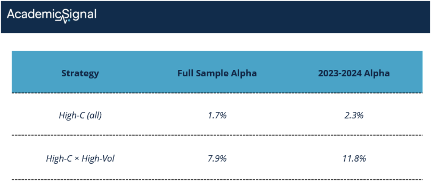
Stocks with positive constrained ownership outperformed. In 2023-2024, when constraints were tightest:
High-C stocks beat low-C stocks by 2.3% cumulatively over 6 months
A simple high-C portfolio earned 2.3% annual alpha
Sorting additionally on volatility boosted returns dramatically: high-C, high-volatility stocks earned 11.8% annual alpha
The authors also found that constrained funds underperform after hitting the limit. Large-cap growth funds lost 1.03% in the three months following constraint binding during 2023-2024. That's forced selling showing up in the performance numbers.
Why 2023-2024 shows much stronger effects
The constraint barely mattered before 2023. Look at the progression:
The 50/5/10 rule was a formality for decades because no single stock dominated indexes enough to push funds over the limit. Then came the Magnificent 7 rally:
Top 10 stocks' share of total market cap: 13% (2015) → 31% (2024)
Top 10 stocks' share of large-cap growth: 30% (2015) → 48% (2024)
The Mag 7 alone = 55% of the Russell 1000 Growth Index
When Apple is 12% of your benchmark and you're trying to minimize tracking error, you want to hold 12% in Apple. But the 50/5/10 rule says you can't have more than 50% of your portfolio in positions exceeding 5%. With multiple mega-caps above 5% benchmark weight, the math stops working.
The full-sample results (2019-2024) are diluted by years when the constraint wasn't binding. The 2023-2024 results show what happens when it actually bites.
Why volatility amplifies the effect
Volatility amplifies this effect through two channels:
Channel 1: Compliance risk drives preemptive trimming
A position at 4.9% in a low-volatility stock might stay below 5% for months. The same position in a volatile stock could easily drift to 5.2% in a week, pushing the fund out of compliance. Fund managers know this, so they trim volatile positions harder and earlier.
The data confirms this. For constrained funds, the trimming of positions in the 5-6% range is significantly more aggressive when volatility is high. The interaction coefficient (volatility × marginal large position) is negative and significant.
Channel 2: Bigger forced sales = bigger mispricings
If constrained funds are selling harder in volatile names, those names should be more underpriced. And indeed, the return predictability is concentrated in high-volatility stocks:
The high-volatility sort nearly quintuples the alpha. This isn't just a volatility premium – it's the volatility interaction with constrained ownership that matters.
Concrete example: Fidelity Blue Chip Growth Fund
The paper mentions that Fidelity's $67 billion Blue Chip Growth Fund actually breached the 50/5/10 constraint in 2024. Here's how that plays out:
The setup:
Fund tracks large-cap growth stocks, benchmark heavily weighted toward Mag 7
By late 2023, positions in Apple, Microsoft, Nvidia, Amazon, Meta, Alphabet, and Tesla are all substantial
Each one wants to be 8-12% of the portfolio to match benchmark weights
The math problem:
If you hold 7 stocks at 8% each = 56% of portfolio in "large positions"
But the 50/5/10 rule caps large positions at 50% total
You're 6 percentage points over the limit
The forced response:
Trim the biggest positions regardless of your fundamental view
Maybe reduce Nvidia from 12% to 9%, Microsoft from 10% to 8%
Or increase cash holdings to dilute all positions below 5%
Implementation considerations
For someone actually trying to trade this:
Data source: NPORT-P filings on SEC EDGAR, available with ~60-day lag (however, only the third month of each fiscal quarter is made public)
Signal construction:
Identify funds with buffers approaching 5%
Find their large positions (>5% weight)
Calculate C for each stock
Sort on C, then on volatility within high-C
Timing: The lag is manageable. Using lagged C values (from the prior quarter) still produced ~10% annual alpha in the high-volatility sort
2. When pension plans must sell: an exploitable pattern in PE secondary markets
Overallocated Investors and Secondary Transactions (December 10, 2025) - Link to paper
TLDR
After markets decline, pension plans overallocated to PE are 8.6 percentage points more likely to sell stakes, and accept discounts 5.6 points steeper than peers
Secondary sales spike during public market declines because PE valuations lag, mechanically pushing allocations above policy limits
Overallocated sellers target high-NAV positions (not underperformers), creating buying opportunities in quality assets at distressed prices
Why pension plans get stuck
Public pension plans operate under rigid investment policy statements that specify target allocations to each asset class (say 60% public equities, 30% fixed income, and 10% private equity). These targets aren't suggestions. They're approved by boards, reviewed by actuaries, and subject to public scrutiny. Deviating too far triggers governance headaches.
The problem: PE allocations don't behave like public market allocations. Once you commit capital to a PE fund, you're locked in for 10+ years. You can't rebalance by selling shares on an exchange. The GP controls when capital gets called and when exits happen.
So when market movements push your actual PE allocation above target, your options are limited.
How overallocation happens: Two mechanical effects
Understanding the "numerator" and "denominator" effects is essential to grasping why secondary market supply surges after certain market conditions.
The denominator effect (public markets crash)
Imagine a pension plan with $100 billion in total assets: $50 billion in public equities, $40 billion in bonds, and $10 billion in PE.
Now public equities drop 20%. The equity portfolio falls to $40 billion. But PE valuations are sticky – GPs only mark portfolios quarterly, and those marks lag reality. So PE stays at $10 billion (at least on paper).
New math: Total assets = $40B + $40B + $10B = $90 billion. PE allocation = $10B / $90B = 11.1%.
The plan is now overallocated to PE by 1.1 percentage points; not because they bought more PE, but because the denominator (total portfolio) shrank while PE held steady. This is the denominator effect.
The numerator effect (PE valuations surge)
The opposite can also cause problems. In 2021, PE returned 47% for the average pension plan versus 36% for public equities. When PE outperforms, the numerator (PE assets) grows faster than the rest of the portfolio, pushing PE allocation above target.
2021-2022: Both effects hit simultaneously
This is what made 2021-2022 so painful. First, surging PE valuations in 2021 pushed many plans above target (numerator effect). Then the 2022 public market decline – with PE showing +18% returns while public equities fell 16% – amplified the problem (denominator effect).
The result: the number of overallocated pension plans hit an all-time high in 2022.
How the authors identified secret sales
But secondary sales by pension plans are rarely disclosed publicly. So how do you study them?
The researchers exploited a quirk of public pension transparency. Under state Freedom of Information Act requirements, public plans must report quarterly performance for every PE fund in their portfolio: NAV, contributions, distributions, IRR.
The key insight: When a plan stops reporting on a fund that other LPs continue to update, that plan sold its stake.
A concrete example
Oregon's public pension fund (Oregon PERF) reported quarterly data on Court Square Capital Partners III through Q4 2019. Then the reports stopped – NAV went to zero.
Did the fund liquidate? No. Connecticut, Arkansas, Minnesota, and Maryland pension plans kept reporting new data on the same fund through 2022 and beyond. The fund was alive and generating returns.
Conclusion: Oregon PERF sold its stake in Q4 2019.
Using this method across Pitchbook data, the authors identified 1,278 secondary sales by 137 U.S. public pension plans between 2001 and 2022. On average, plans sell 8.5% of their PE investments before fund liquidation.
The core finding: Overallocation drives selling
The authors used a difference-in-differences framework around the 2021-2022 market shocks. They compared plans that were overallocated before the shocks (treatment group) to those that were underallocated (control group).
The results:
Overallocated plans were 8.6 percentage points more likely to make any secondary sale
They tripled the fraction of their PE portfolio sold relative to underallocated peers
The effect intensified over time: sales jumped in 2021 (numerator effect) and accelerated further in 2022 (denominator effect)
Importantly, other plan characteristics – size, funding ratio, liquidity needs – showed weak or no relationship to selling behavior. Overallocation was the dominant driver.
Why don't plans use other levers?
If secondary sales are costly (spoiler: they are), why not adjust through other channels?
Cutting new commitments?
The authors found no meaningful reduction in the number of new commitments. Plans slightly reduced commitment sizes (down ~12%), but they kept investing. Why? Skipping vintages damages GP relationships, creates gaps in expected cash flows, and disrupts pacing models. As one Canadian pension CIO put it: "The worst thing that can happen at a pension fund is to miss a vintage."
Plus, cutting commitments today doesn't fix overallocation today. You're still stuck with your existing PE assets.
Raising target allocations?
Plans did modestly increase targets – about 0.5 to 1.2 percentage points. But revising investment policy is a governance nightmare. It requires board approval, asset-liability studies, actuarial reviews, and public disclosure. Some plans can only revise targets every five years by law.
Secondary sales as the pressure valve
By elimination, secondary sales become the only tool for immediate relief. Sell a stake today, reduce your allocation today. It's expensive, but it works.
The price of urgency: Overallocated sellers pay more
The authors developed a clever method to estimate sale discounts from public filings. By tracking the final distributions and contributions reported before a stake disappears, they could back into implied transaction prices.
The findings:
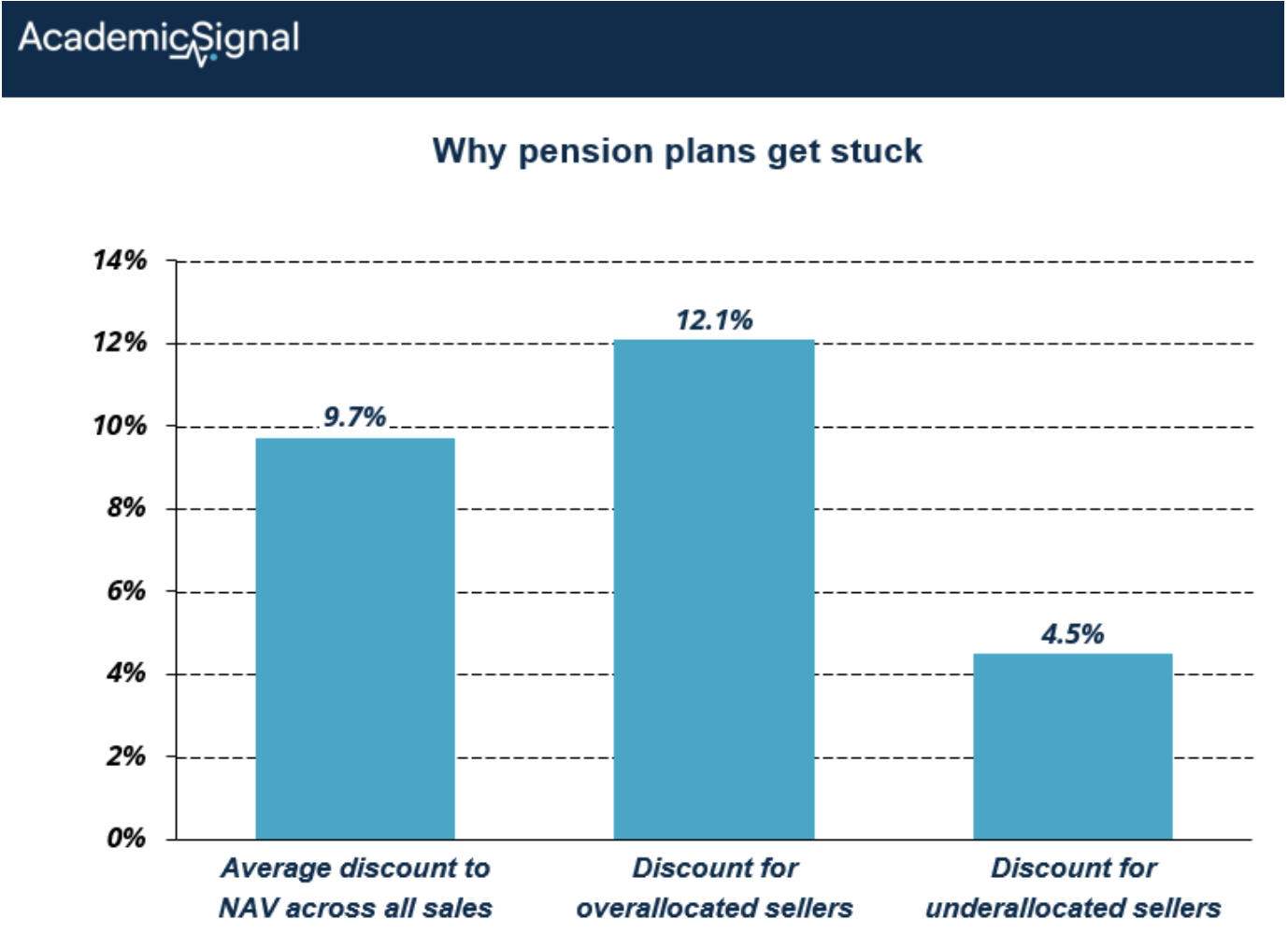
This gap persists even after accounting for market conditions. Overallocated plans accept worse pricing because they need to sell – classic forced-seller dynamics.
For context, that 5.6-point discount gap on a $100 million stake means leaving $5.6 million on the table. Multiply across a large secondary portfolio, and you're looking at serious alpha for the other side of those trades.
What gets sold: Quality, not garbage
Here's the surprising part. You might expect distressed sellers to dump their worst-performing funds. They don't.
The authors found no relationship between fund performance (IRR, TVPI, DPI) and sale probability for overallocated plans. What did predict sales? Higher NAV.
The logic is straightforward: if you're overallocated by 2 percentage points, selling a $50 million position barely moves the needle. Selling a $500 million position solves your problem. Overallocated plans sell their biggest stakes – regardless of performance – because that's what actually reduces allocation.
This is critical for secondary buyers. These aren't lemons being dumped. These are often high-quality, mid-life funds from blue-chip GPs, sold because the LP has a portfolio construction problem, not an asset quality problem.
The bottom line
For secondary buyers:
Public market declines create systematic opportunities. When equities drop 15-20%, the denominator effect kicks in across the pension universe. Within 2-4 quarters, secondary supply will often surge as overallocated plans rush to rebalance.
Track publicly available pension allocation data against policy targets. The Public Plans Database (maintained by Boston College) provides this information. When you see widespread target breaches across the pension universe, get ready – motivated sellers are coming, and they'll be price takers.
Focus on high-NAV positions from overallocated sellers. These are the stakes most likely to be sold, and they're not performance-driven exits. You're buying quality assets from motivated sellers at 5+ point discounts to fair value.
For PE allocators and GPs:
Understand that your LP base faces real constraints. When markets move against them, even your best relationships may need to sell. The good news: this paper shows LPs strongly prefer to maintain new commitments rather than disrupt GP relationships. The adjustment happens in the secondary market, not the primary market.
For pension plan managers:
The paper implicitly makes the case for more dynamic allocation policies. Static targets combined with illiquid assets create forced-selling situations that destroy value. Plans that can tolerate wider allocation bands – or adjust targets more nimbly – can avoid selling quality assets at distressed prices.
3. Research-grounded Investor Q&A: “Does the yield curve actually predict recessions, or do we just remember the times it worked?”
The yield curve genuinely predicts recessions – it's not survivorship bias. The foundational work by Estrella & Mishkin (1996) established that the 10-year minus 3-month Treasury spread significantly outperforms all other financial and macroeconomic indicators in predicting recessions two to six quarters ahead, with only one false positive since 1950 (the 1966 credit crunch).
But the mechanism matters more than the inversion itself.
To understand why, you need to decompose what's actually inside a long-term yield. Any 10-year Treasury yield contains two components:
The market's expectation of what short-term rates will average over the next 10 years, and
The term premium: extra compensation investors demand for locking up money for a decade instead of rolling over short-term bills. Think of the term premium as a "duration risk fee": investors face uncertainty about future inflation, Fed policy, and their own liquidity needs, so they require additional yield to hold long-dated bonds.
Rosenberg & Maurer (2008) decomposed the yield spread into these two components and found that only the expectations component predicts recessions – the term premium is noise.
When the curve inverts because investors expect the Fed to cut rates aggressively (signaling economic weakness ahead), that's a genuine recession signal.
When it inverts because term premiums have collapsed due to foreign demand for safe assets or quantitative easing, the signal is muddied.
The role of monetary policy stance
This explains why context matters. Cooper, Fuhrer & Olivei (2020) showed that inversions during accommodative monetary policy systematically overstate recession probability.
"Accommodative" means the Fed's policy rate sits below the neutral rate – the theoretical rate that neither stimulates nor restricts growth. When policy is accommodative, the economy is receiving stimulus; an inversion in this environment often reflects technical factors (like compressed term premiums) rather than genuine recession expectations.
The 2019 inversion illustrates this perfectly: the curve inverted not because the Fed was hiking aggressively to cool an overheating economy (the classic recession setup), but because long-term yields fell as global investors piled into Treasuries for safety. The Fed was actually cutting rates at the time. Cooper et al. found that accounting for monetary policy stance dramatically reduces the recession probability implied by such inversions.
A better measure: the near-term forward spread
The critical refinement came from Engstrom & Sharpe (2018), who demonstrated that the "near-term forward spread" statistically dominates the traditional 10Y-2Y spread. This spread measures the difference between the implied 3-month rate 18 months from now and today's 3-month rate.
Here's how the implied rate works: If you know the yield on an 18-month Treasury and the yield on a 21-month Treasury, you can back out what rate the market is pricing for a 3-month loan starting 18 months from now. It's a forward rate embedded in today's yield curve. The math is straightforward: if the 18-month zero-coupon yield is 4.0% and the 21-month yield is 3.9%, the market is implying that 3-month rates 18 months hence will be lower than today – i.e., the market expects the Fed to ease.
When this near-term forward spread turns negative – meaning markets expect the 3-month rate to be lower in 18 months than it is today – it signals that investors are pricing in Fed rate cuts, which historically occur because economic weakness is anticipated.
Once you include this measure in recession models, yields beyond 18 months add zero predictive value. The 10-year yield's contribution is apparently just a noisier proxy for this near-term policy expectation.
Why the 2022-2023 inversion hasn't (yet) produced a recession
The 2022-2023 inversion – the longest in modern history at 16+ months – has produced no recession through late 2025. This wasn't a failure of the yield curve; it's a case study in why decomposition matters.
Several factors suppressed the term premium during this period, creating an inversion that looked alarming but lacked the usual recessionary mechanics:
Unprecedented Fed forward guidance: Starting in 2022, the Fed communicated an unusually explicit rate path – "higher for longer" – with detailed dot plots and press conference guidance. This transparency reduced uncertainty about future policy, which is precisely what term premium compensates investors for. When you know the Fed plans to hold rates at 5.25% for an extended period, you don't need as much extra yield to hold a 10-year bond. The term premium compresses. Contrast this with the Volcker era, when policy was far less predictable and term premiums were accordingly higher.
Fiscal stimulus and locked-in mortgages: Pandemic-era stimulus checks and the fact that most homeowners had refinanced into 3% mortgages meant household balance sheets were unusually resilient to rate hikes. The transmission mechanism from Fed policy to economic pain was blunted.
Foreign demand for safe assets: Continued appetite from foreign central banks and institutions for U.S. Treasuries kept long-term yields lower than domestic conditions alone would imply.
The lesson: the yield curve's predictive power is real, but it requires understanding why the curve is shaped as it is. An inversion driven by expectations of Fed easing in response to weakness (the Engstrom-Sharpe signal) is genuinely ominous. An inversion driven by term premium compression from Fed transparency or global safe-asset demand is a different animal entirely.
Disclaimer
This publication is for informational and educational purposes only. It is not investment, legal, tax, or accounting advice, and it is not an offer to buy or sell any security. Investing involves risk, including loss of principal. Past performance does not guarantee future results. Data and opinions are based on sources believed to be reliable, but accuracy and completeness are not guaranteed. You are responsible for your own investment decisions. If you need advice for your situation, consult a qualified professional.